"Graphic Design is my Passion" & WE HEART NY
By me(Drew McDonald) and my very good friend Mia Crocco
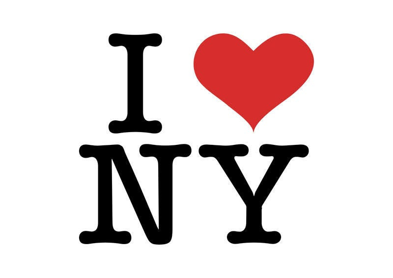
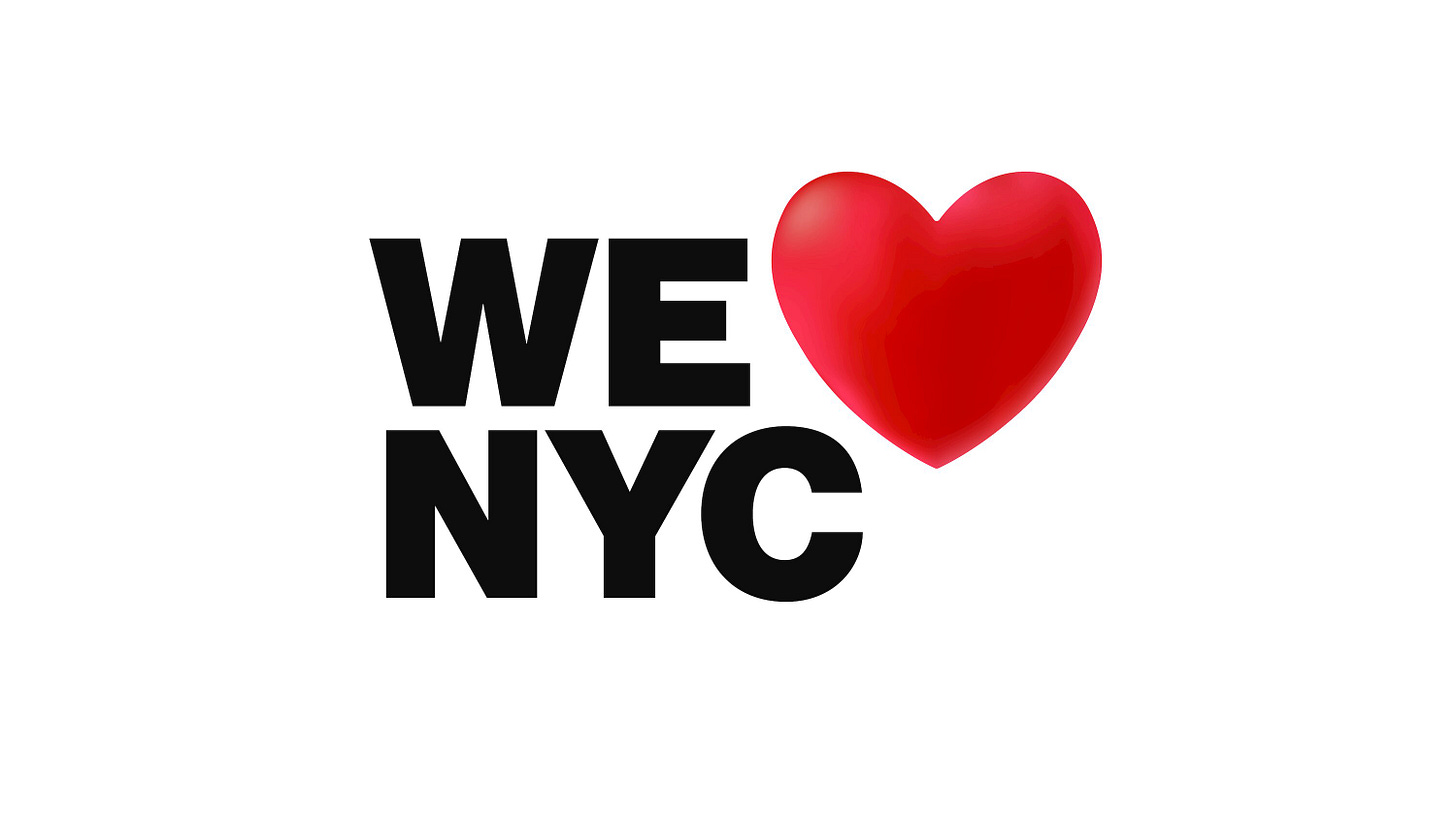
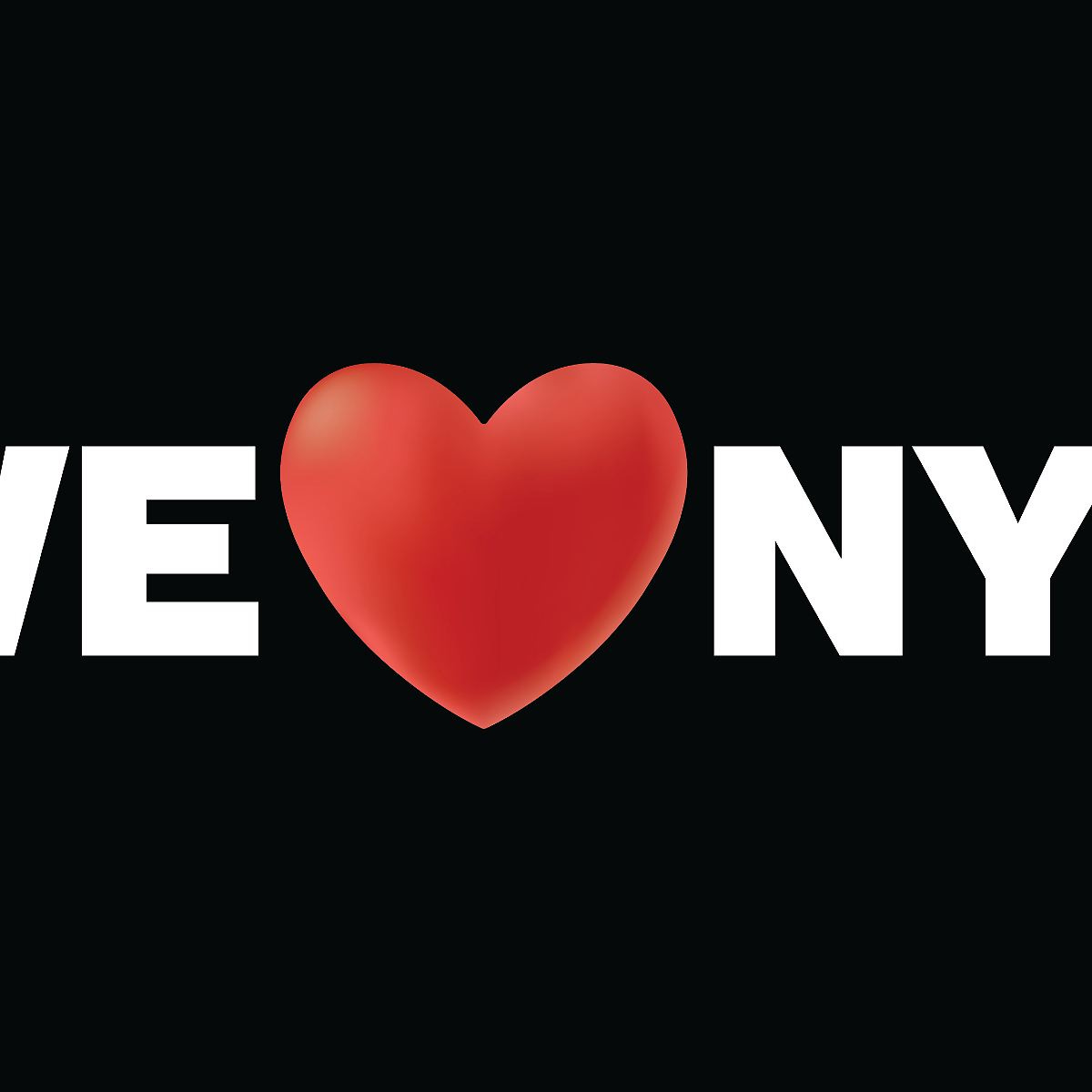
New York’s I <3 NY logo has been one of the most iconic images of the 21st century. Since 1975, New Yorkers have enjoyed the kitschy, simple, tourist-friendly logo on t-shirts, mugs, and even condoms. But the Partnership for New York City decided to mess that all up to support New Yorkers who were adversely affected by the COVID-19 pandemic, essentially making something that affected literally the entire world solely about a city filled with insufferable, selfish, elitist pricks. Apart from the reasoning behind the new logo, it’s also just fucking ugly. The heart in the old one was perfectly fine; simple, easy to reproduce, and easy to print. But these idiots just had to be fucking special and change it to this dumbass liberal gradient that is now there for no reason. NO ONE GIVES A SHIT IF THE GRADIENT LOOKS 3D IF IT LOOKS AWFUL AND GOOFY and stupid as hell. It’s also just a terrible marketing change because any image or reproduction that can’t display the heart on a high-resolution print or screen will look awful. “Graphic design is my passion” ass looking heart.
To be completely honest, the change in the new logo text font for the “WE” and “NYC” isn’t even that irreprehensible; its “impact” akin font is still undoubtedly less cute than the original logo’s rounded slab serif font called “American Typewriter,” but even that okayish font misstep is completely eclipsed by just how stupid of an idea adding a lightened gradient onto the heart for literally no good discernable reason other than to be “new,” “special,” and “different.”
New York City is quite literally the center of the world. It’s the Michael Jackson of cities. People faint just looking at the skyline. Everything about New York is supposed to be iconic, from the Empire State Building to the trash bag piles in the streets. But nothing about this logo is iconic. It literally looks like something a middle schooler would make in a digital media class.
To be honest, I kind of like that they changed the text from “NY” to “NYC” so that we city dwellers don’t take up the whole of New York State identity(We already do), but also, who is “we”? When have you ever heard a New Yorker care about another New Yorker? That’s like the whole ethos. That’s why when you see someone fall on the subway, you run in the other direction because it usually means they’re trying to kill you or eat your hair. That’s why when you give the guy on the street 20 bucks because you “accidentally” bumped into him after spilling his salad that was 90% rice, you look like a fucking punk instead of a good neighbor. If you’re going to be all holier-than-thou about helping others and being a decent person, move to Cleveland, but I respect the Partnership for New York City’s fleeting attempt at fostering a culture of “New Yorker community.”
Overall, this logo change is a classic example of “if it ain’t broke, don’t fix it”. But they did fix it. And now it’s broke. Which is actually emblematic of most New Yorkers. So maybe they were on the right track here, but that gradient on the heart is still so fucking stupid.


